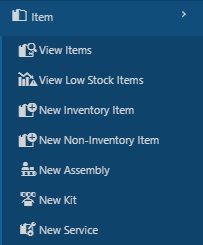
View Items
The first screen you will see when you log into InventoryCloud is the View Items screen. This page lists all the items you have in your database.
- Tree View
- Group By
- Show Filter
- Save View & Choose Custom View
- Export
- Delete
- Quick Search
- Print Tag/Label
- Quick Links to Transactions
You can also access the following screens from this
- View/Edit Inventory Item
- View/Edit Non-Inventory Item
- View/Edit Assembly
- View/Edit Kit
- View/Edit Service Item
View Items
- Click on Item > View Items.
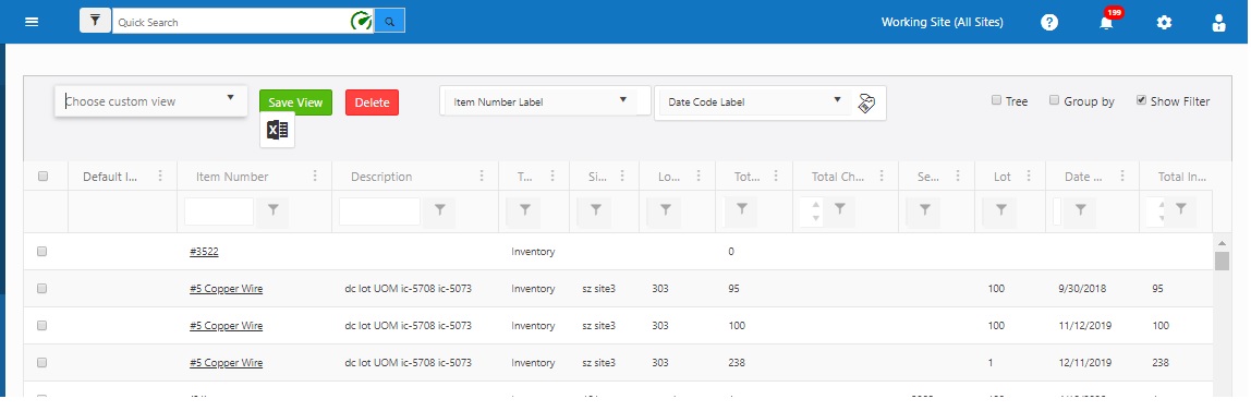
- The View Items screen will appear. The screen will display details like item number, description, total available, total checked out, total in-house, on order, committed, lot, date code, serial number, site, location, attachment, dimensions, pricing, etc.

- Attachment - It will display "Yes" if any item has any attachment. "Yes" is a hyperlink that will navigate to the attachment tab of the item screen.

- Expand icon - Click on the expand icon next to the checkbox to view the trackbys. It will display quantity, site, location, container ID, serial number, lot, and date code.

Note
- The following columns will be disabled when the tree view and show filter checkbox is checked - Total Available, Total Checked Out, and Total In House.
- The Basic version of InventoryCloud will not have an On Order and Committed Column.

Workspace Overview
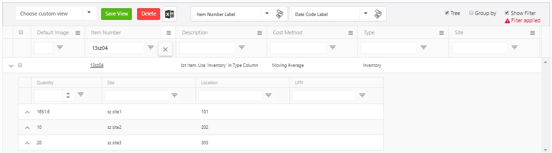
- Tree View - The view item screen displays all the items placed at many sites or locations separately. But in the tree view option, the view list displays the item list in such a way that you can view an item's locations, sites, container ID, and quantity at each location/site in one place just by clicking on the expand icon.
- Check the Tree checkbox to enable the tree view.
- You will notice an expand icon next to the checkboxes.

- Click on the expand icon to view all the sites, locations, container ID, and quantity.

- Note that you can also use the show filter option.
- Group By - This feature allows you to "group" the displayed information so you can view data in a way that is most easy to read for you. You can have as many groups as you want depending on how you want to view your information. For instance, if you want all items grouped by location, you can quickly set this up using Group By checkbox.
- Check the Group By checkbox to enable the group view.

- Drag the column header and drop it into the designated grey area.

- The items on the view items screen will group based on the header that you dragged and dropped.

- You can also use the show filter option.
- Show Filter - This feature allows you to narrow down the displayed results to a range of items or a specific item.
- Click on the Show Filter checkbox.

- A text box will appear below each column. Enter the text you want to search (for example, an item number - 13sz04) and click enter. A message "Filter Applied" will appear under the Show Filter checkbox.
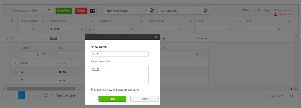
- Save View & Choose Custom View - This feature allows you to save your list view settings. It includes filters (search criteria), group settings, reordered columns, etc. You can save as many views as you want. The Manage Views screen allows you to control which views should appear on the "Choose custom view" list,
- An example, consider that you used the show filter option and searched for the item "13sz04". Then you used tree view to view the item's locations and quantity. Once your View Item screen is ready to be saved, click on the Save View button. Enter the view name and description. Check " if you want to make the view available to everyone."
- Choose Custom View - The dropdown list will list all the views accessible to you.
- You can view the saved views on Settings -> Manage Views screen.
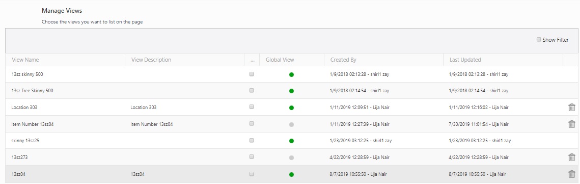
- Select "All Items" on the Choose Custom View dropdown to switch back to the normal view.
- Export - This option allows you to export the list of items to an Excel spreadsheet. The button has two options - Excel and CSV.
- If the grid has less than 50K records, the user may choose to export .xls or .csv.
- If the grid has over 50K records, the user can only choose csv.
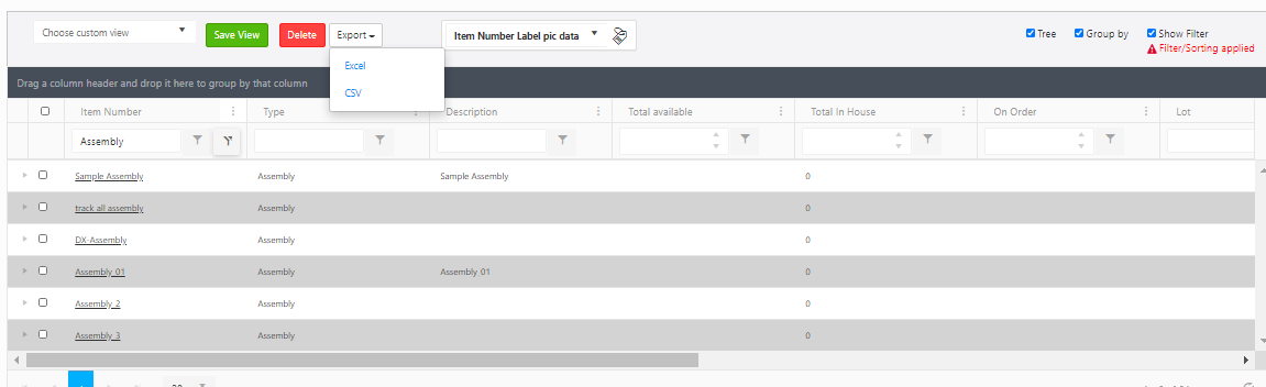
- Filter or group the list as needed, then click on Export. The report will get downloaded. In many browsers, the downloaded file can be accessed using an icon at the bottom or edge of the browser. Refer to your browser’s help for more information about finding your downloaded files.
 Click on Delete again on the confirmation screen.

Note: You cannot delete an item with quantity.
- Quick Search - The Quick Search option helps the user to perform a search query on the selected columns. It reduces the query time and increases your efficiency while working with that selected set of items.
Important Note:
When you perform a quick search, the tree view will be cleared out, and matched data will be loaded in a flat view. Similarly, Whenever the tree mode is selected, the current quick search will be cleared so that the grid queries the live DB.
The Quick Search cannot be used with the Custom view feature i.e., If the custom view is selected, that clearly indicates that the Quick Search is performed/completed, and so, in this case, the Quick search will be cleared, and the stored custom view will load ‘normally’.
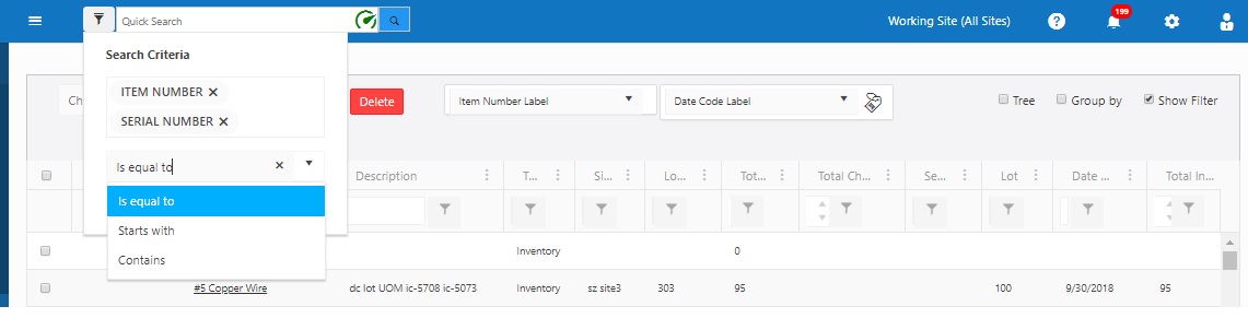
Advanced drop-down filter icon - This Advanced drop-down filter icon appears next to the Quick search field.
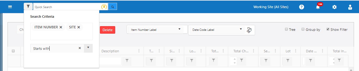
- To perform a quick search, click on the advanced drop-down filter icon. A drop-down list will appear. It will display the following fields - Item Number and Serial number by default. Also, the operator "Is equal to" will be selected by default. To delete the default fields, click on the cross button next to it.
Note: You can only choose up to three (3) fields in the advanced drop-down filter icon.

- Click on the area below the serial number, and a drop-down list will appear. It will show a list of color coded fields. This color indicates how fast a quick search will perform when you select a particular field. The field color codes are green, yellow, and red.
- Green indicates fast
- Yellow indicates Intermediate
- Red indicates slow

- In addition to selecting the field to search for, there are three operators available They are - Is equal to, Starts with, and Contains. The operator "Is equal to" indicates green, "Starts with" indicates yellow and "Contains" indicates red.
Speedometer Icons
- Three different types of speedometer icons will appear next to the quick search box based on your search criteria selection.
- The green speedometer indicates that the advanced search will be quick.

- The yellow speedometer will appear when the advanced search will be intermediate or average.
- The red speedometer will appear when the advanced search will be slow.
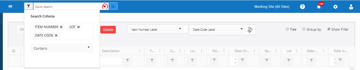
Note: The type of speedometer that appears in the quick search box depends on the Advanced Search choices that the user makes. The choice includes the selection of fields and the operator.
Performing a Quick Search
- Enter or scan the text in the quick search field after selecting the search criteria. Click on the search button. Note: Quick Search is supposed to be quick, so the tree view will be cleared out before performing a quick search. You can group the result sets.
- Once you perform the quick search, it will display the matching Items based on the search criteria selected. A Clear Quick Search will be added to the Filter warning menu.
- The Show Filter option can be used after a Quick Search.
- Click on the Show Filter checkbox. The text box will appear under all the fields. Enter the text or number that you want to search and then press Enter. The list will be narrowed down even further.
- The Initial search will fetch an initial result set of 500 records. Click on the More button to display a result set of up to 10000 records.
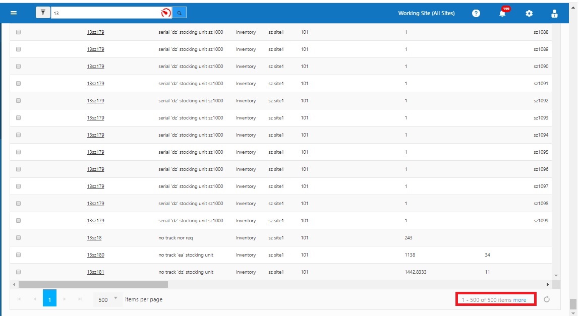
Warning: The current Quick Search result set is stored in the local storage of your browser. So if your browser asks you to “Increase Local Storage” allow it to do so - or reformulate your Quick Search criteria to result in fewer records.
Warning: This result set can be further grouped, filtered and sorted very quickly. We recommend using the right mouse button with this quick result set, opening other pages in separate tabs to work as quickly as possible, but keep in mind the result set will not include changes to records made by other users or changes made on pages in other tabs until you clear or refresh your result set.
Note: You must select a Label Printer before printing tags from the List screens. To do this, see the topic Choosing a Printer.

- Print Item Label - The drop-down list of Print Item Labels are the Item number label and Item number label pic.
- Print Inventory Label - The drop-down list of Print Inventory Labels are Date Code Label, Lot Label, Serial Number Label, Lot Date Code Label, Serial Number Date Code Label, Serial Number Lot Label, Serial Number Lot Date Code Label, No Trackby Label.
Refer to the topic - Design Reports > Adding a variable in the label layout
- Print the Label - Select the item for which you want to print tags by clicking on the checkbox(s) and then select the label you want to print.
Example 1 - No Trackby Label as shown in the below image
Note:
When the Tree checkbox is unchecked - To print only certain locations/trackbys, make sure the Tree is unchecked (at the upper right) in the View Items grid. Items with multiple combinations of locations/trackbys will show on multiple lines, which can then be checked and printed. If you need a different number of labels, you will need to print them multiple times.

When the Tree checkbox is checked - The item will appear along with the trackbys.

Click on the Label Tag -  icon. The report view of the labels will appear in a separate tab. You can scroll through them, save them, and/or print them using the buttons on the menu bar.

Example 2 - Printing Lot Label
Select the Lot Label option.
Select the Item number from the View Item list. Check the lot column to make sure that the lot column of the selected item has data in it as shown below.

Click on the Label Tag icon. The report view of the labels will appear in a separate tab. You can scroll through them, save them and/or print them using the buttons on the menu bar.

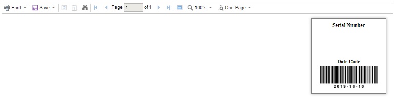
Note - Before printing a label, always check if the data is available for the selected item. Example - Printing Serial Number Data Code Label.
Consider the below example - Item number - 13sz342 has a date code but no serial number.
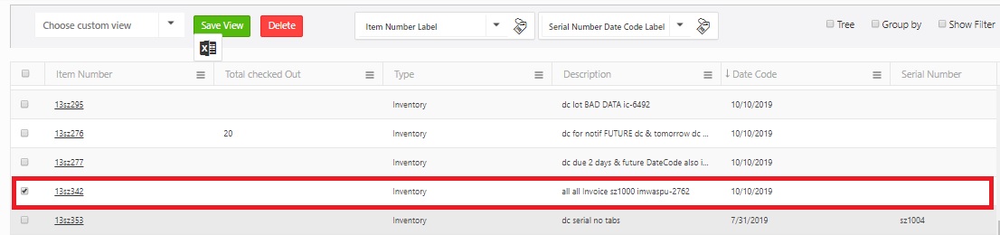
When you click on the Label Tag icon - . The report will get generated, and it will only have a date code.
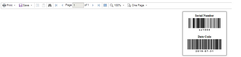
The Item number - 13sz353 has a serial number and date code. The report will display both details.
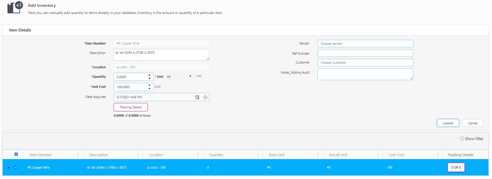
- Quick Links to Transactions / Context Menu - The quick links will take you to the transaction screens. Note that the context menu will not appear if the tree view mode is on. To access the quick links:
- Select an item. Right-click away on the same row away from the item number. The following list of options will appear - Add, Remove, Adjust, Check Out, Check In, and Move.

- Click on the transaction that you want to perform. For example, consider that you clicked on "Add".
- The screen will navigate to the Add Inventory screen, where you will notice the item number on the Add Inventory queue.